Fundamentals of data visualisation
Data Visualisation with R

Why data visualisation?
- Data visualisation is a powerful tool to explore, understand and communicate data
Table
Plot
A data visualisation catalogue
- There are many plot types, including some below
- The choice of plot type depends on the data and the message you want to convey
Visualising distributions
- Histograms, boxplots and violin plots are common plot types to show distribution of continuous variables
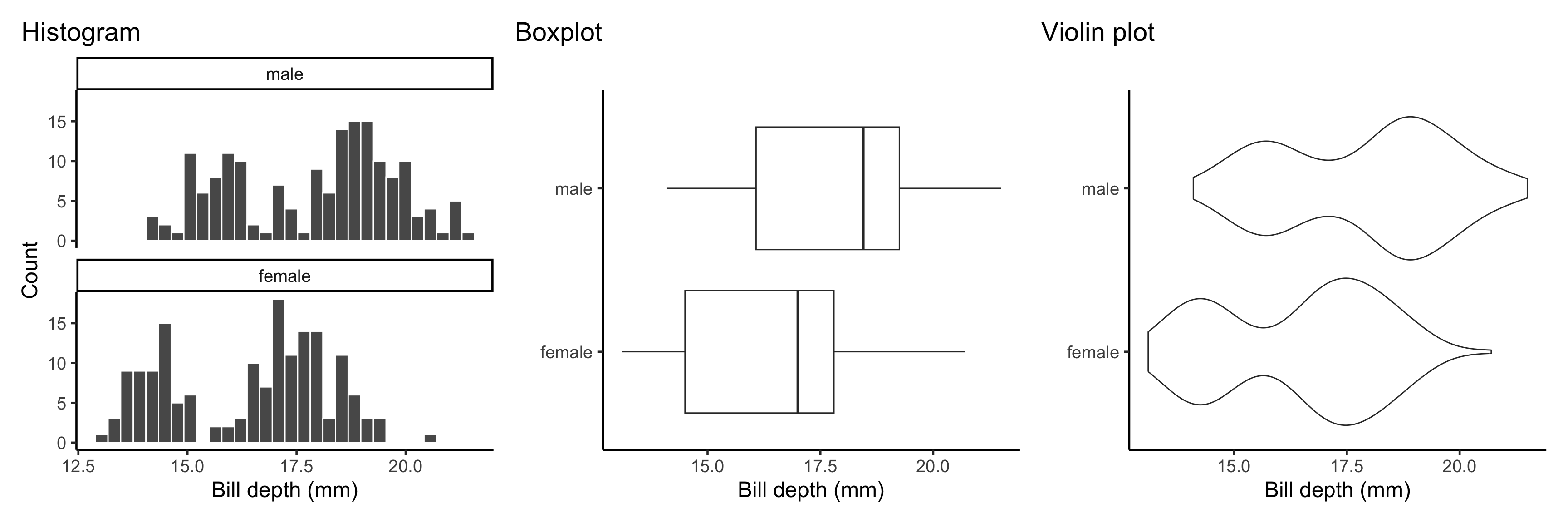
- Boxplots depict the five number summary (min, Q1, median, Q3, max) of the data and can be great to compare distributions between groups
- But here boxplot fails to display the bimodality of the bill depth
- Histogram and violin plot do a better job displaying the bimodality in this example
Adjust visualisation parameters
- Some plot types have adjustable parameters and it’s important to consider changing these parameters from default values
- For example, the number of bins in a histogram, the bandwidth in a density plot, the length of whiskers in a boxplot, etc.
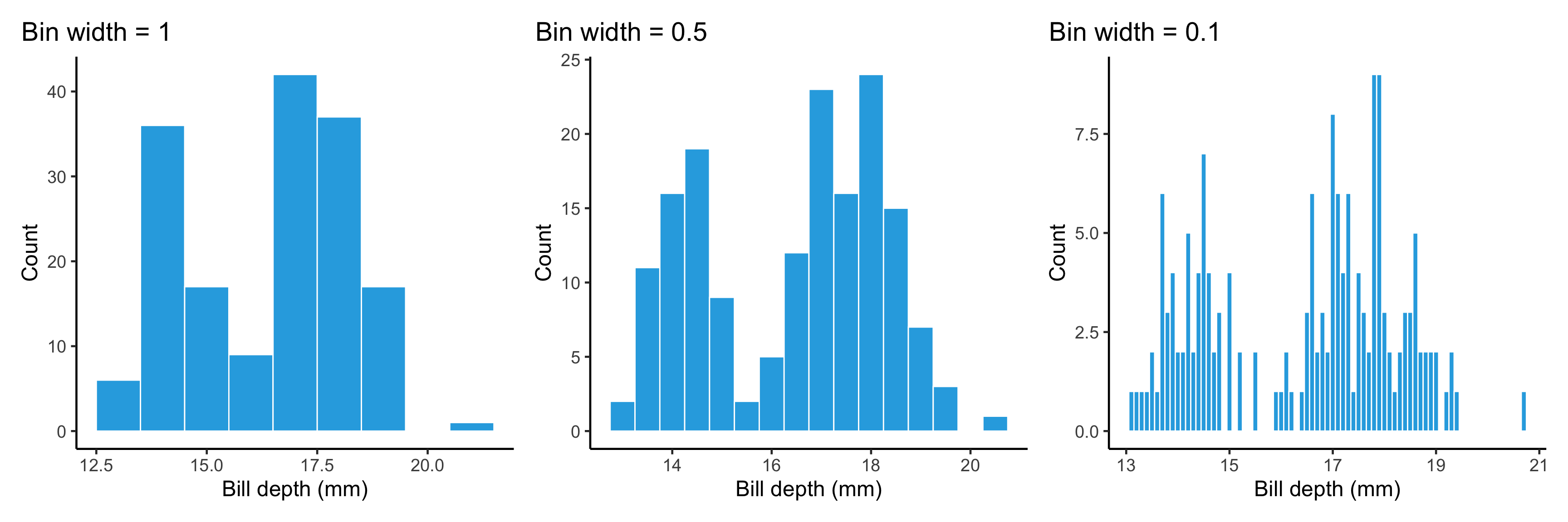
- Adjusting the number of bins or bin width in a histogram is paritcularly important to uncover the underlying distribution of the data
Visualising amounts
- Bar plots are the predominant approach to show the distribution of categorical variables or count data
- Pie charts are poor in reading the actual proportions and should be avoided in general
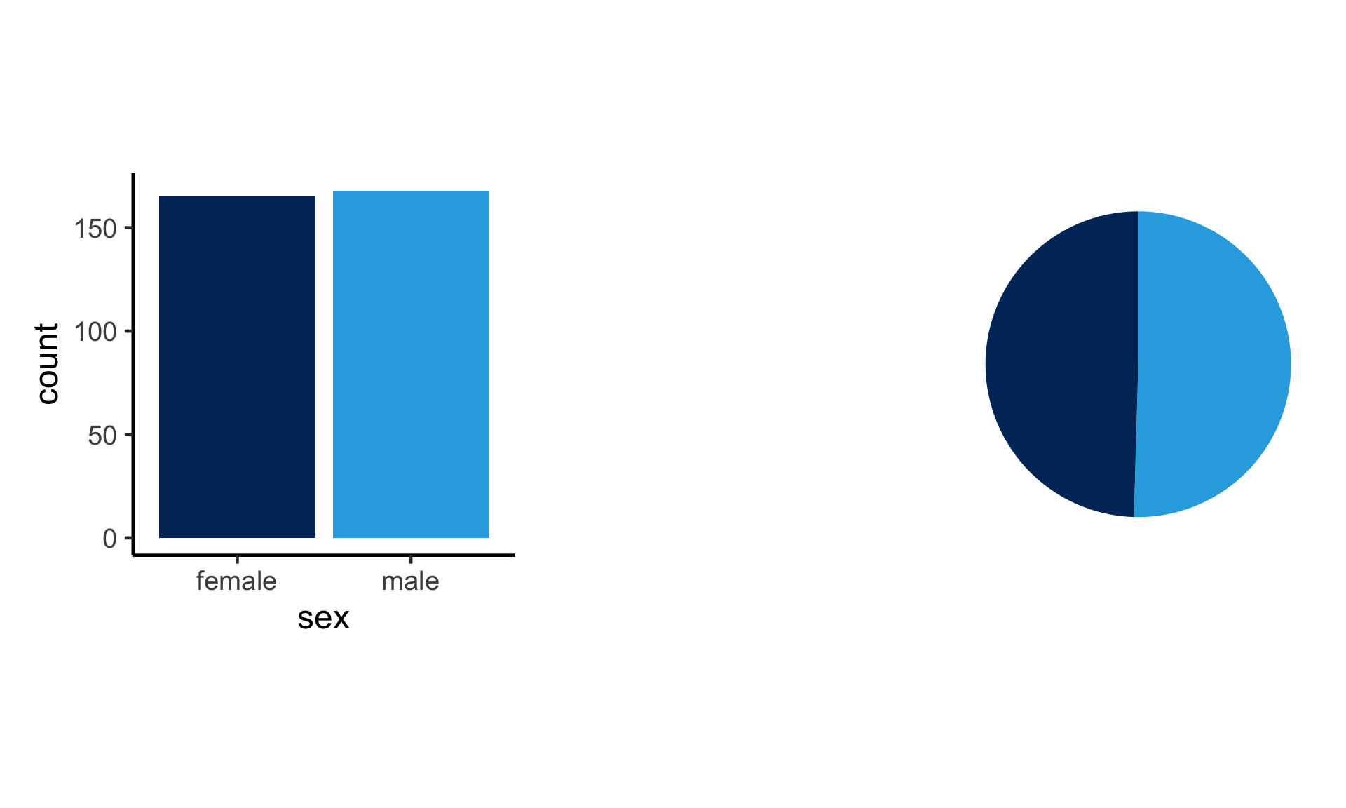
- Is the number of females or males higher based on the above graph?
- Which graph is easier to see that there are more males than females?
Visualising relationships between continous variables
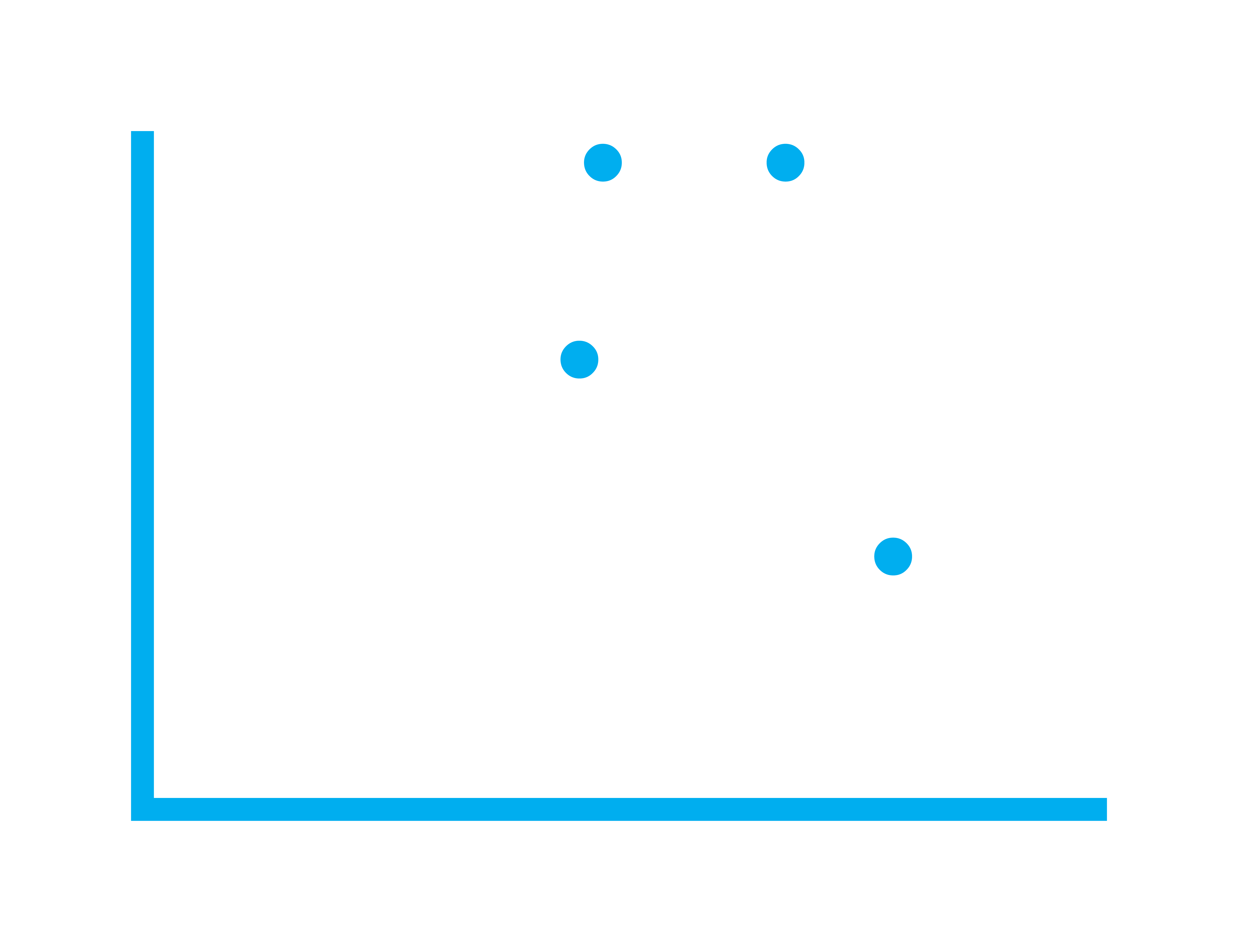
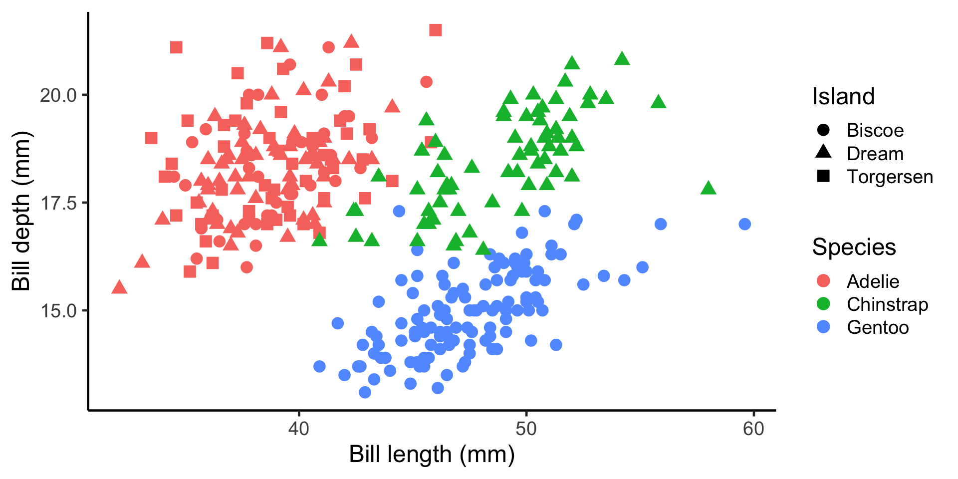
- For visualising bivariate relationships, scatter plots are the most common choice
- You can use different aesthetics for points like color, shape, size, etc. to show additional information
Visualising trends
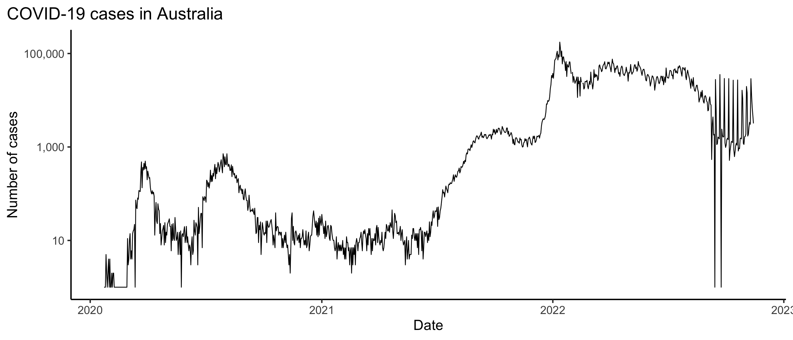
- Line plots are the most common choice to show trends over time

Summary
- Visualisation is a powerful tool to explore and communicate data
- There are many plot types to visualise data
- The choice of plot type depends on the data and the message you want to convey
- Adjusting visualisation parameters is important to uncover the underlying distribution of the data
- Histograms, boxplots and violin plots are common plot types to show distribution of continuous variables
- Bar plots are the predominant approach to show the distribution of categorical variables or count data
- Avoid using pie charts!
- Scatter plots are the most common choice to show bivariate relationships
- Line plots are the most common choice to show trends over time
