| time | topic |
|---|---|
| 3:00-3:20 | What is your plot testing? |
| 3:20-3:35 | Creating null samples |
| 3:35-4:00 | Conducting a lineup test |
| 4:00-4:30 | Testing for best plot design |
Creating data plots for effective decision-making using statistical inference with R
What is your plot testing?
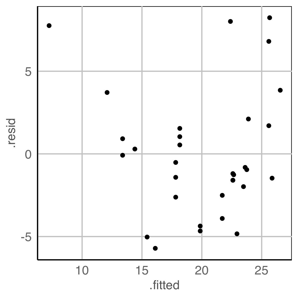
What do you see?
✗ non-linearity
✓ heteroskedasticity
✗ outliers/anomalies
✓ non-normality
✗ fitted value distribution is uniform
Are you sure?
What is your plot testing?
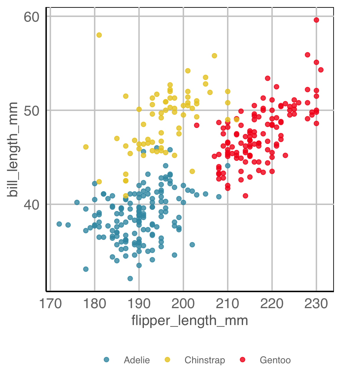
What do you see?
There a difference between the groups
✓ location
✗ shape
✓ outliers/anomalies
Are you sure?
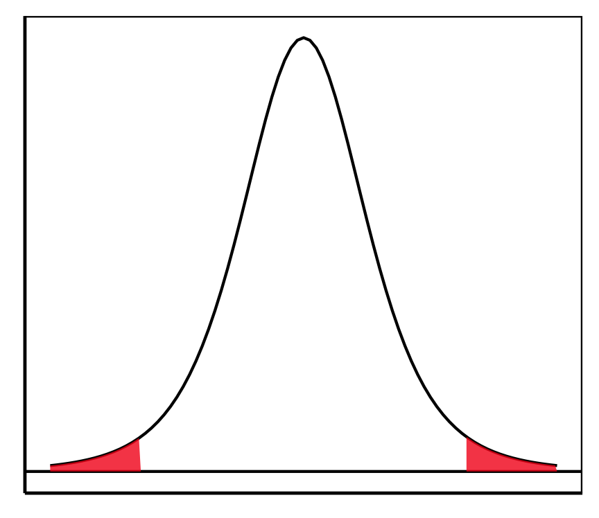
Statistical thinking
Sampling distribution for a t-statistic. Values expected assuming \(H_o\) is true. Shaded areas indicate extreme values.
For making comparisons when plotting, draw a number of null samples, and plot them with the same script in the plot description.
Creating null samples, example 1
ggplot(DATA,
aes(x=VAR1,
y=VAR2,
color=CLASS)) +
geom_point()\(H_o\): There is no difference between the classes.
How would you generate null samples?
Break any association by permuting (scrambling/shuffling/re-sampling) the CLASS variable.
Creating null samples, example 2
LM_FIT <- lm(VAR2 ~ VAR1,
             data = DATA)
FIT_ALL <- augment(LM_FIT)
ggplot(FIT_ALL, aes(x=.FITTED,
                    y=.RESID)) +
geom_point()\(H_o\): There is no relationship between residuals and fitted values.
How would you generate null samples?
Break any association by
- permuting residuals,
- or residual rotation,
- or simulate residuals from a normal distribution.
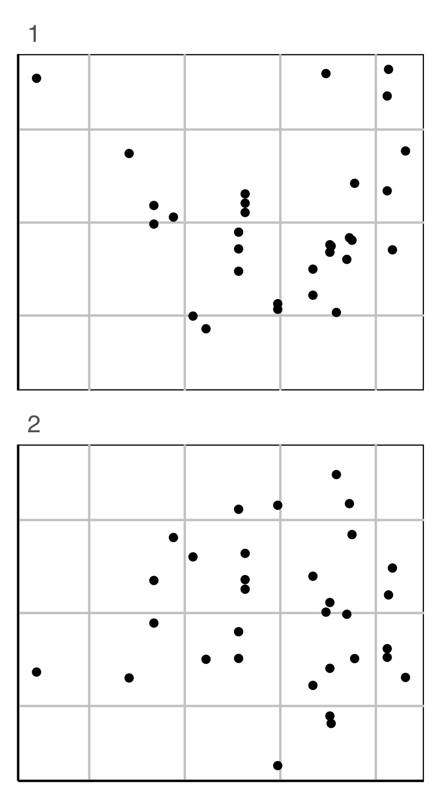
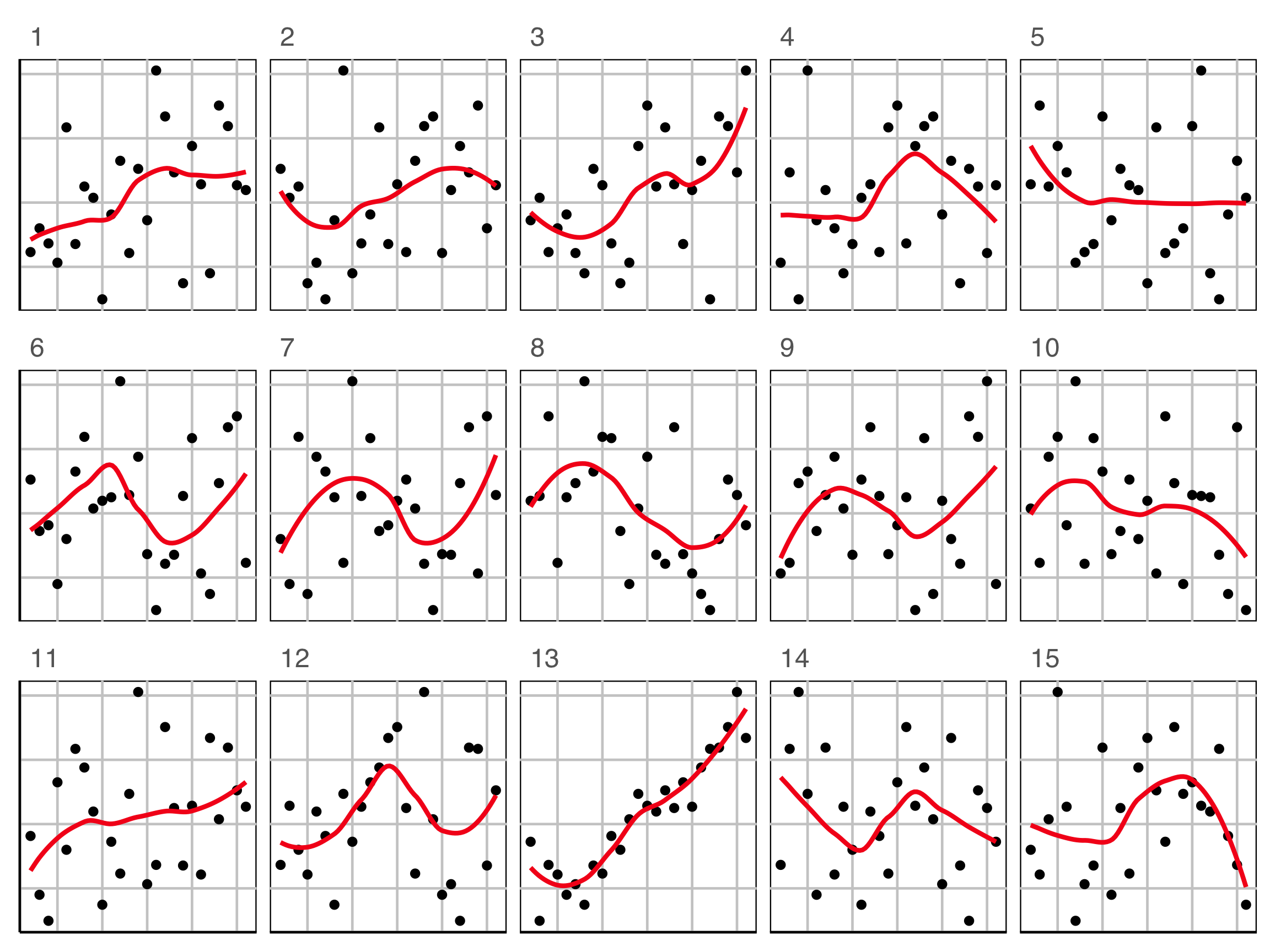
Lineup example 1 (1/2)
Code
set.seed(241)
ggplot(lineup(null_permute("species"), penguins, n=15),
       aes(x=flipper_length_mm,
           y=bill_length_mm,
           color=species)) +
  geom_point(alpha=0.8) +
  facet_wrap(~.sample, ncol=5) +
  scale_color_discrete_divergingx(palette="Zissou 1") +
  theme(legend.position = "none",
        axis.title = element_blank(),
        axis.text = element_blank(),
        panel.grid.major = element_blank())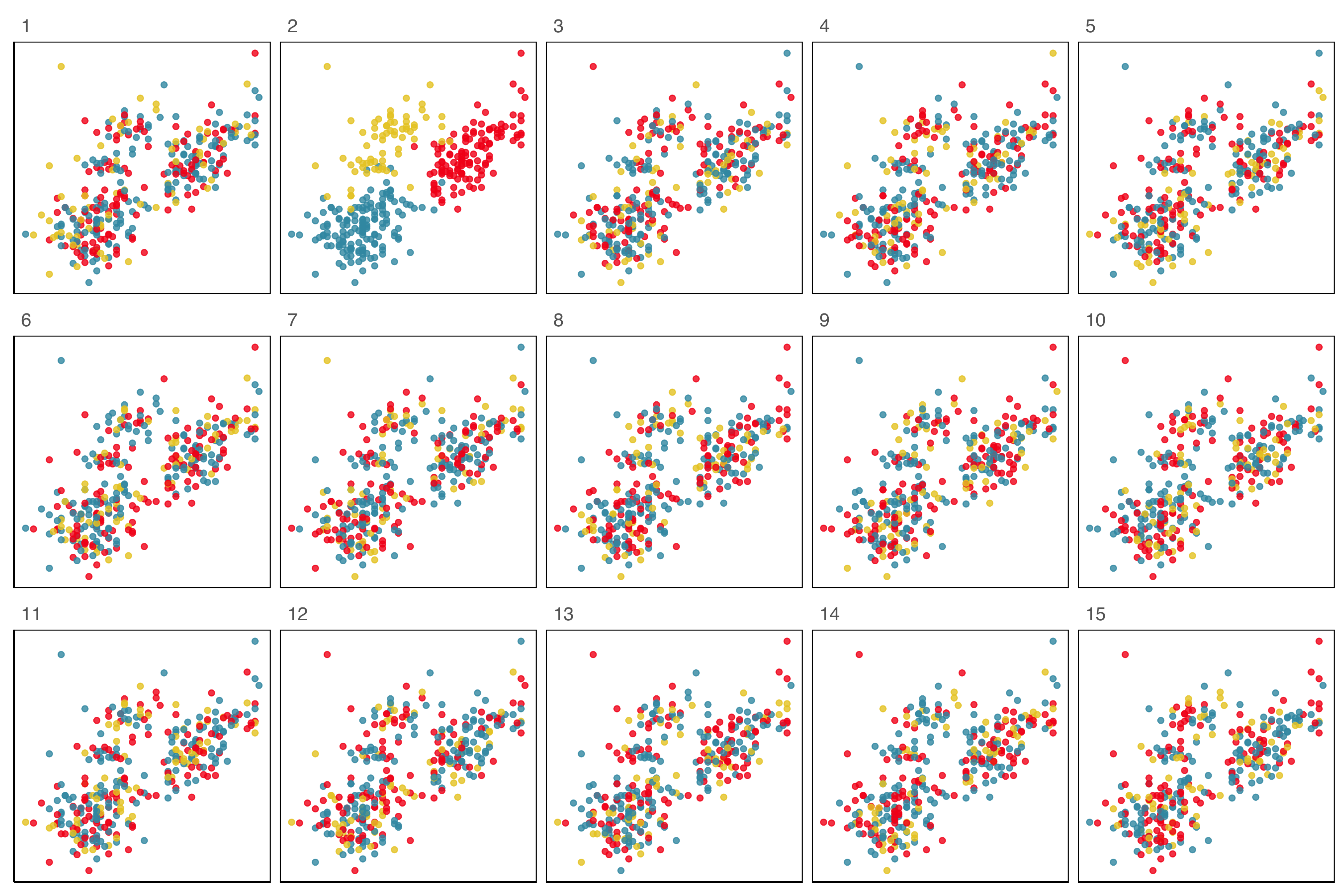
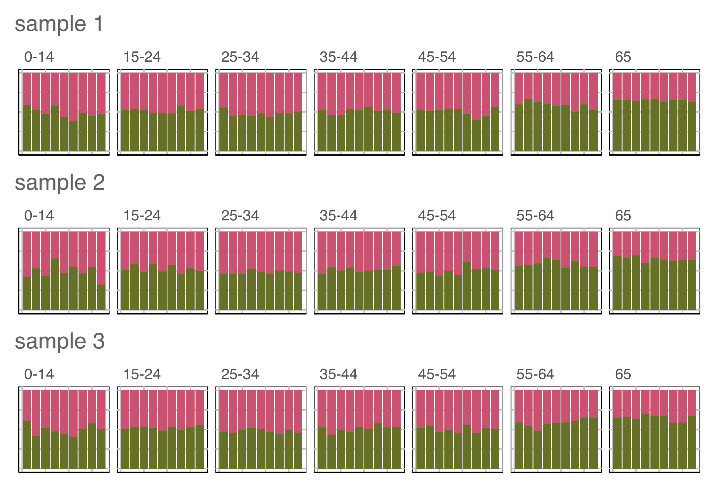
Lineup example 2 (1/2)
Code
data(wasps)
set.seed(258)
wasps_l <- lineup(null_permute("Group"), wasps[,-1], n=15)
wasps_l <- wasps_l %>%
  mutate(LD1 = NA, LD2 = NA)
for (i in unique(wasps_l$.sample)) {
  x <- filter(wasps_l, .sample == i)
  xlda <- MASS::lda(Group~., data=x[,1:42])
  xp <- MASS:::predict.lda(xlda, x, dimen=2)$x
  wasps_l$LD1[wasps_l$.sample == i] <- xp[,1]
  wasps_l$LD2[wasps_l$.sample == i] <- xp[,2]
}
ggplot(wasps_l,
       aes(x=LD1,
           y=LD2,
           color=Group)) +
  geom_point(alpha=0.8) +
  facet_wrap(~.sample, ncol=5) +
  scale_color_discrete_divergingx(palette="Zissou 1") +
  theme(legend.position = "none",
        axis.title = element_blank(),
        axis.text = element_blank(),
        panel.grid.major = element_blank())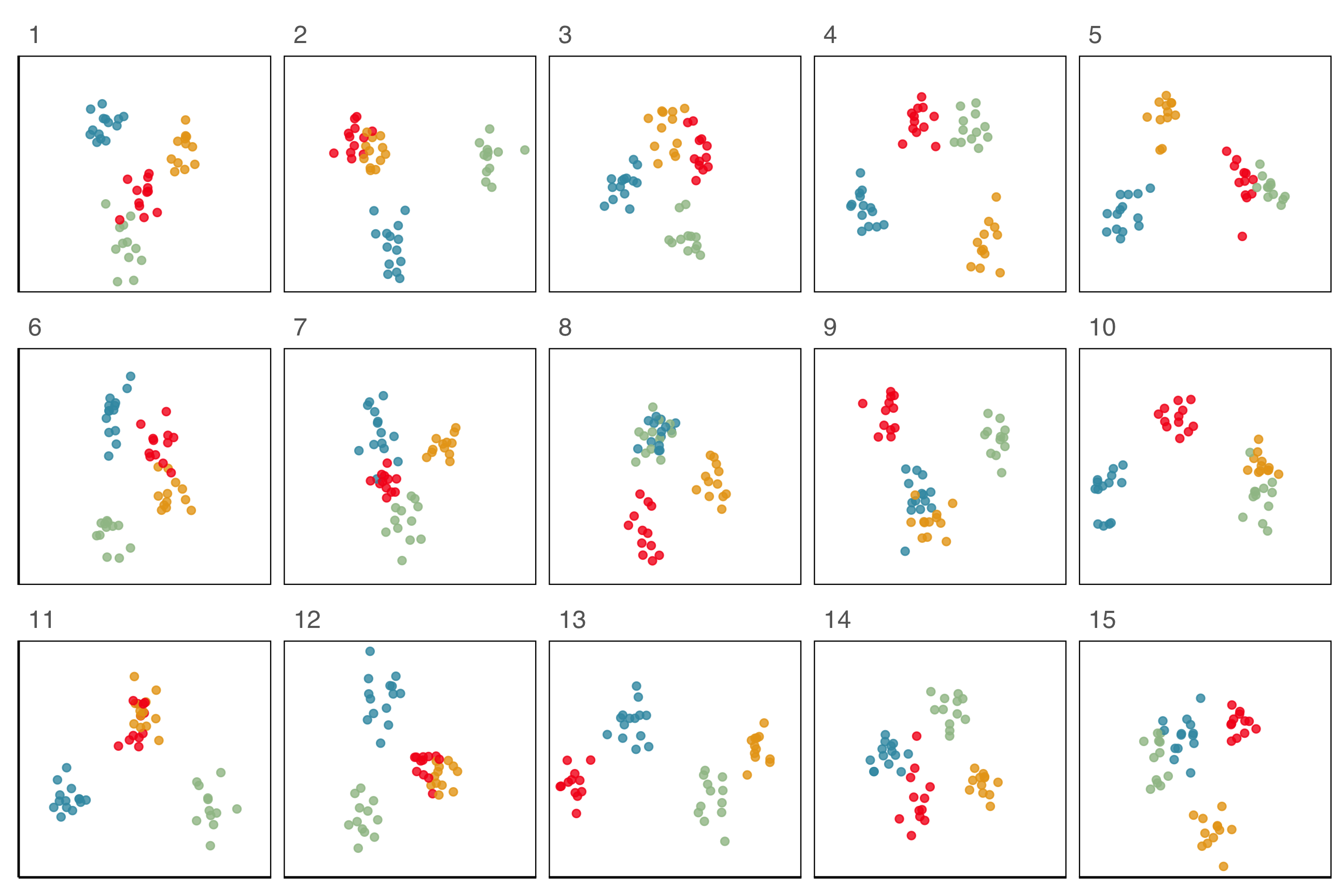
What is the \(p\)-value?
- Suppose \(X\) is the number of nandus out of \(n\) independent tosses.
- Let \(p\) be the probability of getting a
 for this coin.
 - Hypotheses: \(H_0: p = 0.5\) vs. \(H_a: p > 0.5\).
Alternative \(H_a\) is saying we believe that the coin is biased to nandus.
Alternative needs to be decided before seeing data. - Assumption: Each toss is independent with equal chance of getting a nandu.
What is the \(p\)-value?
- Suppose I have a coin that I’m going to flip

- Experiment 1: I flipped the coin 10 times and this is the result:
- The result is 7 nandus and 3 tails. So 70% are nandus.
- Do you believe the coin is biased based on this data?
What is the \(p\)-value?
- Experiment 2: Suppose now I flip the coin 100 times and this is the outcome:
- We observe 70 nandus and 30 tails. So again 70% are nandus.
- Based on this data, do you think the coin is biased?
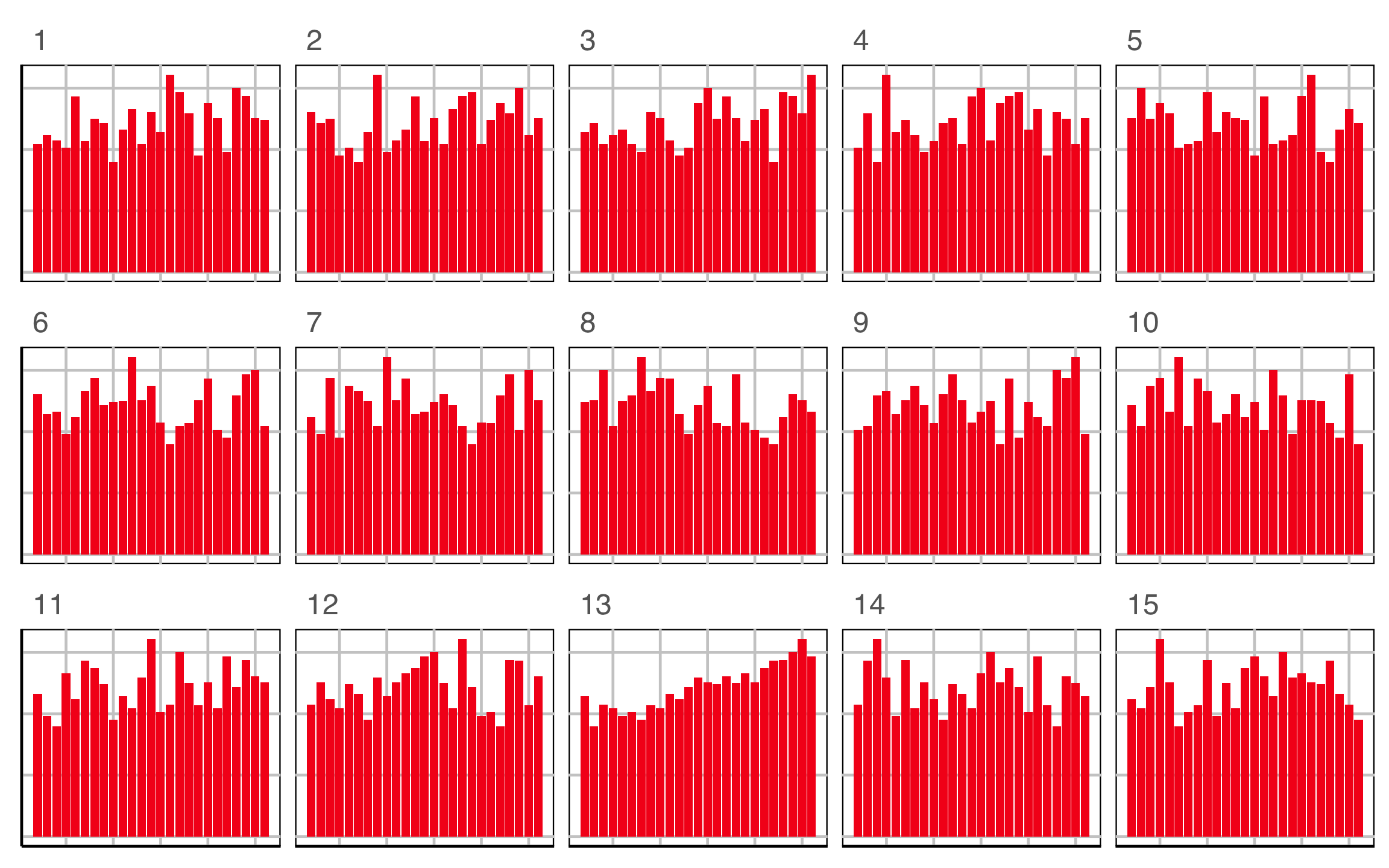
Lineup example 3 (1/2)
Which plot is the most different?
Lineup example 4 (1/2)
Which row of plots is the most different?
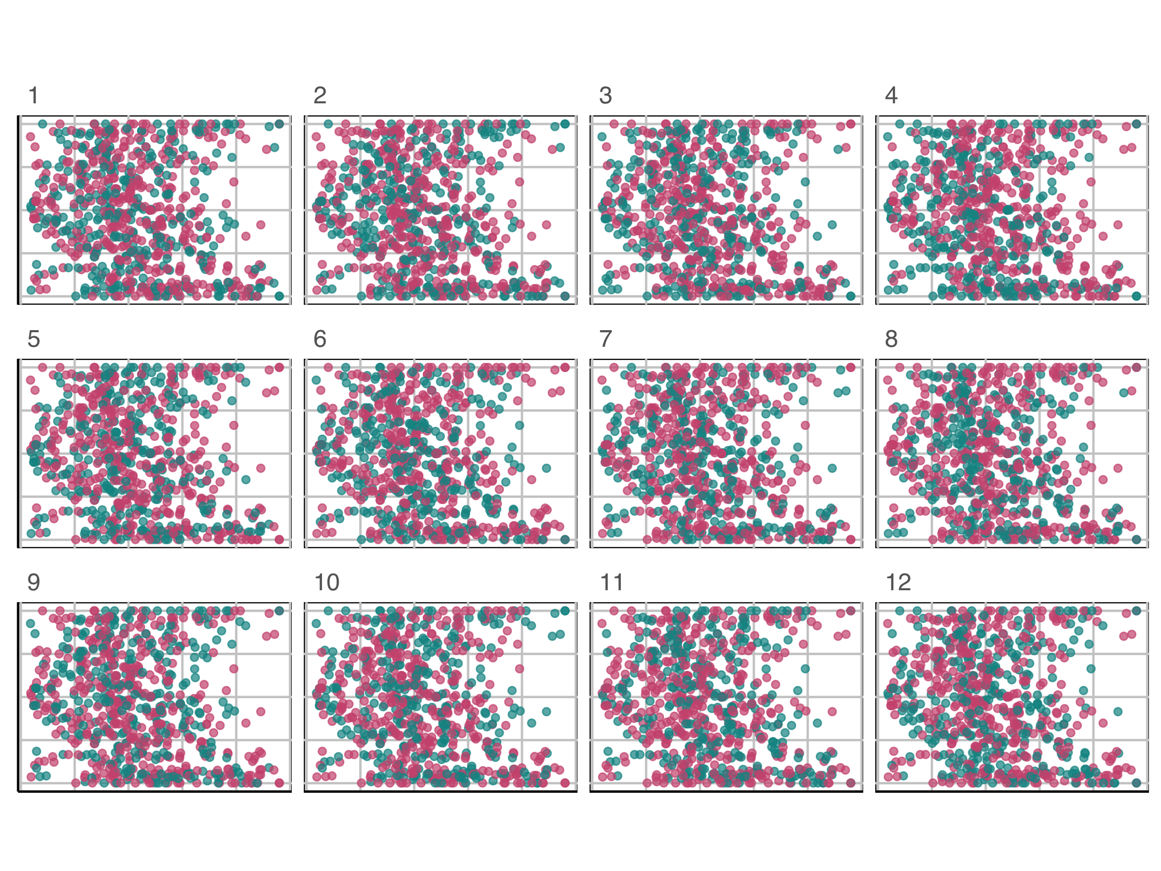
Plot design example 1A
Which plot is the most different?
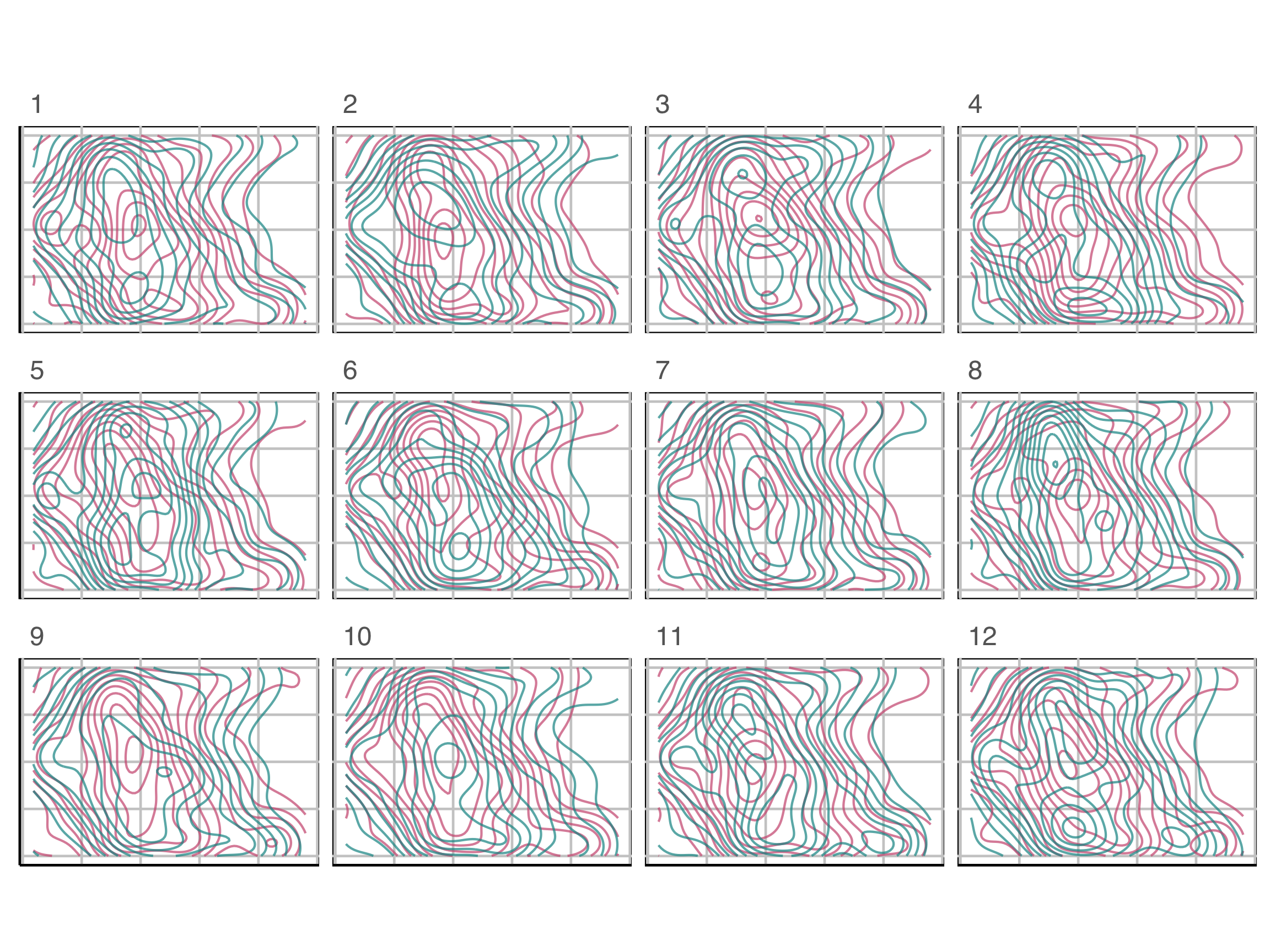
Plot design example 1B
Which plot is the most different?
Plot design example 1
This is the pair of plot designs we are evaluating.
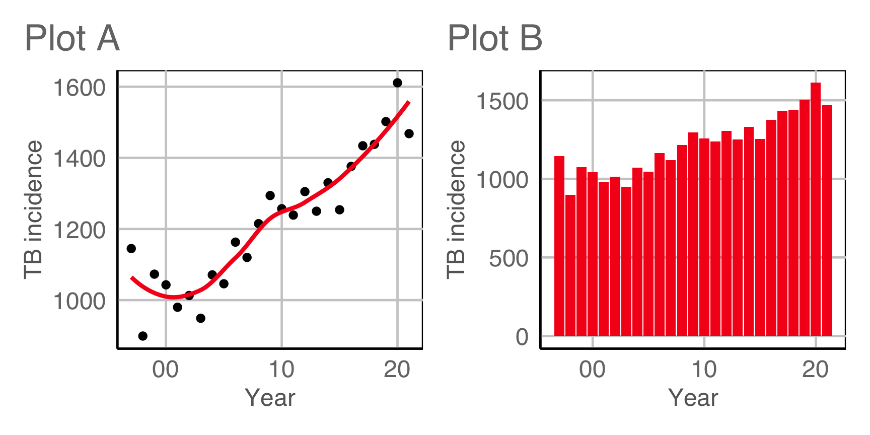
Compute signal strength:
?? / ??Plot design example 2A
Which plot is the most different?
Plot design example 2B
Which plot is the most different?
Plot design example 2
This is the pair of plot designs we are evaluating. Comparing the positions at which passes were made by both teams.
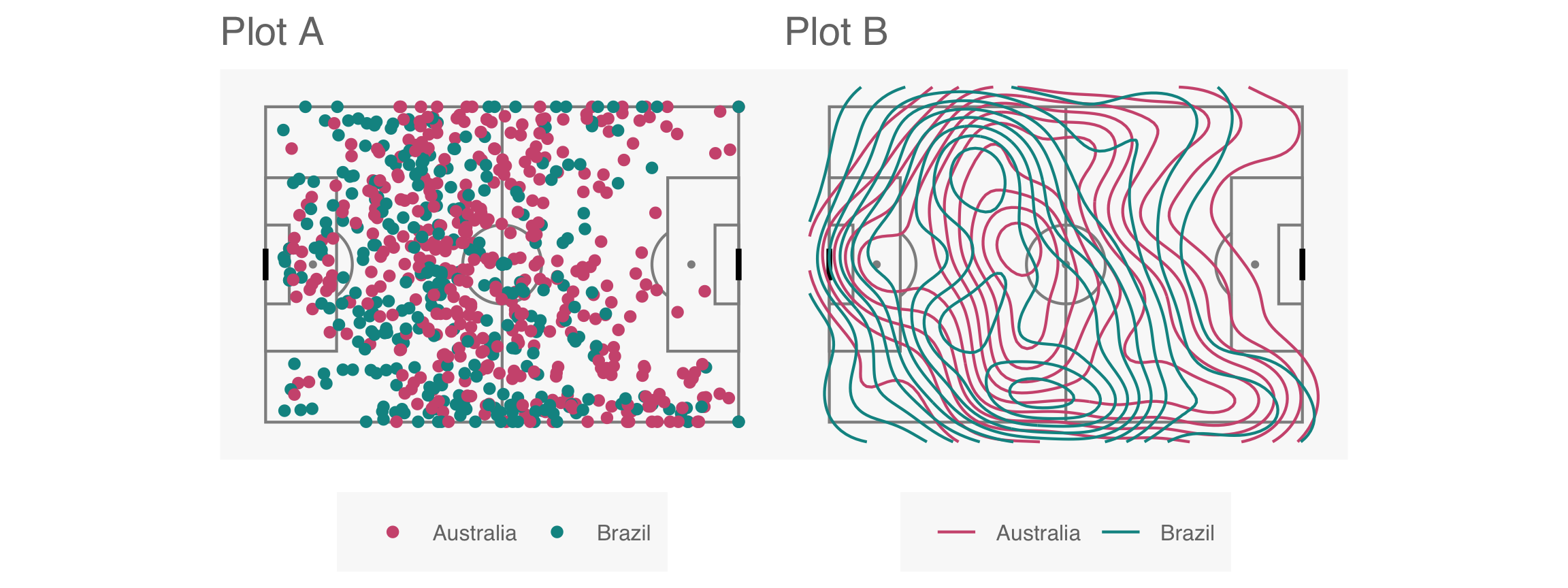
Compute signal strength:
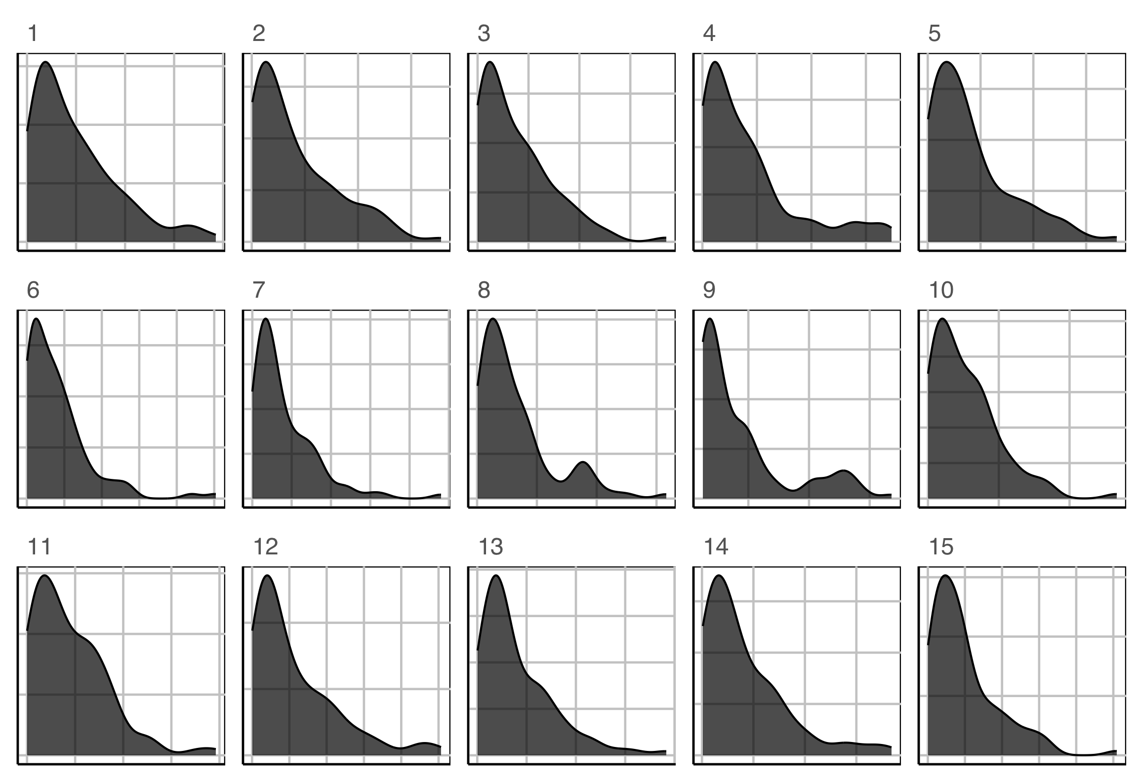
?? / ??Why
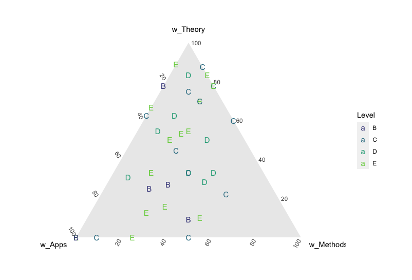
Do you see any clusters here?
My colleague does, but I don’t.
References
- Wickham, Cook, Hofmann, Buja (2010) Graphical Inference for Infovis, IEEE TVCG, https://doi.org/10.1109/TVCG.2010.161.
- Hofmann, Follett, Majumder, Cook (2012) Graphical Tests for Power Comparison of Competing Designs, IEEE TVCG, https://doi.org/10.1109/TVCG.2012.230.
- Buja, Cook, Hofmann, Lawrence, Lee EK, Swayne, Wickham (2009) Statistical inference for exploratory data analysis and model diagnostics, https://doi.org/10.1098/rsta.2009.0120.
- Majumder, Hofmann, Cook (2013) Validation of visual statistical inference, applied to linear models, https://doi.org/10.1080/01621459.2013.808157.
- VanderPlas, Rottger, Cook, Hofmann (2021) Statistical significance calculations for scenarios in visual inference, https://doi.org/10.1002/sta4.337.

This work is licensed under a Creative Commons Attribution-ShareAlike 4.0 International License.