Visualising High-dimensional Data with R

Dianne Cook
Monash University

Session 2

Outline

time topic
3:00-3:45 Understanding clusters in data using visualisation
3:45-4:30 Building better classification models with visual input

Clustering

Method 1: Spin-and-brush

library(detourr)
set.seed(645)
detour(p_tidy_std[,2:5], 
       tour_aes(projection = bl:bm)) |>
       tour_path(grand_tour(2), fps = 60, 
                 max_bases=40) |>
       show_scatter(alpha = 0.7, 
                    axes = FALSE)

DEMO

What are clusters?

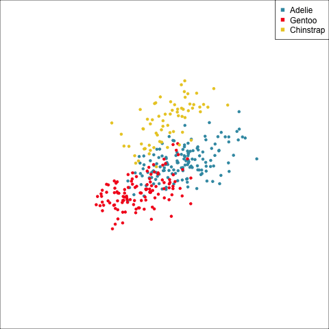
Ideal thinking of neatly separated clusters, but it is rarely encountered in data


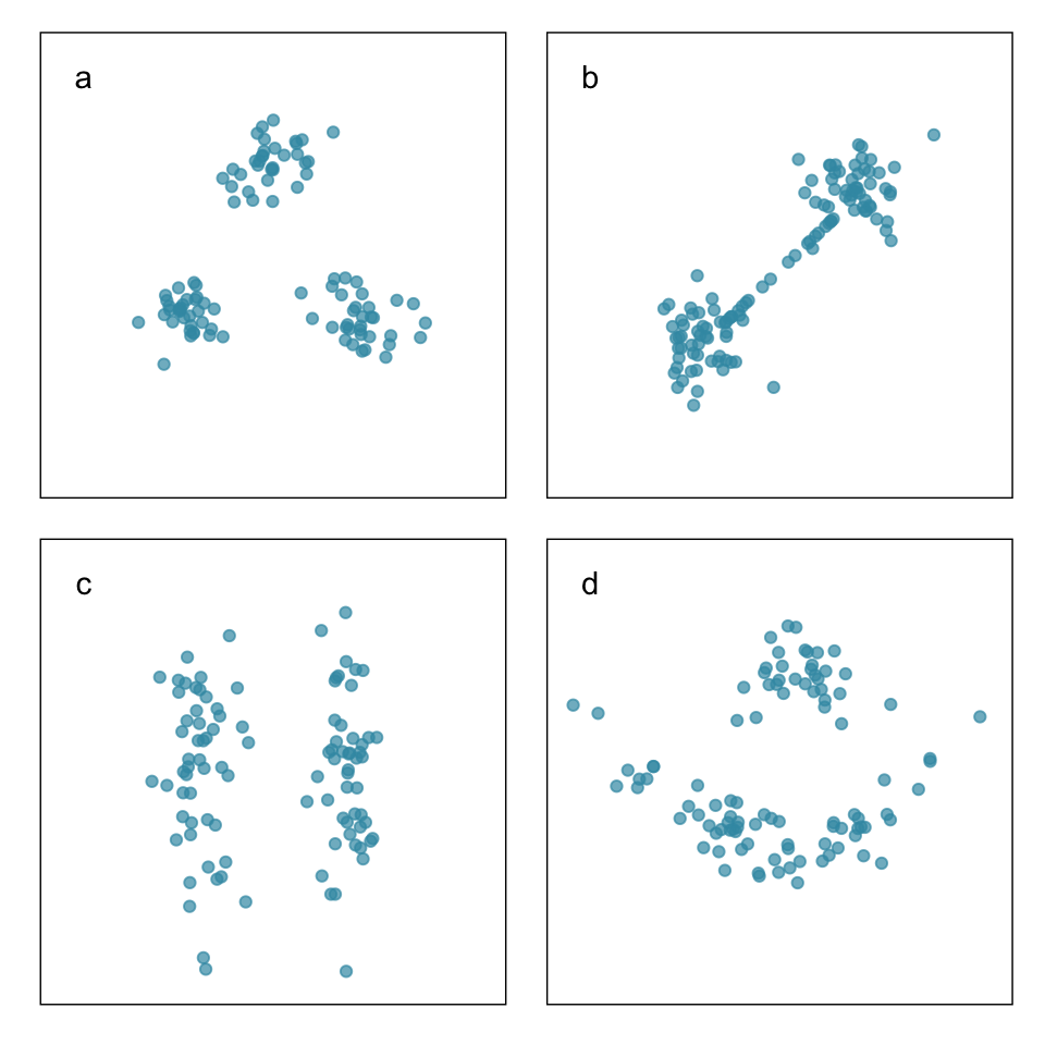
Objective is to organize the cases into groups that are similar in some way. You need a measure of similarity (or distance).

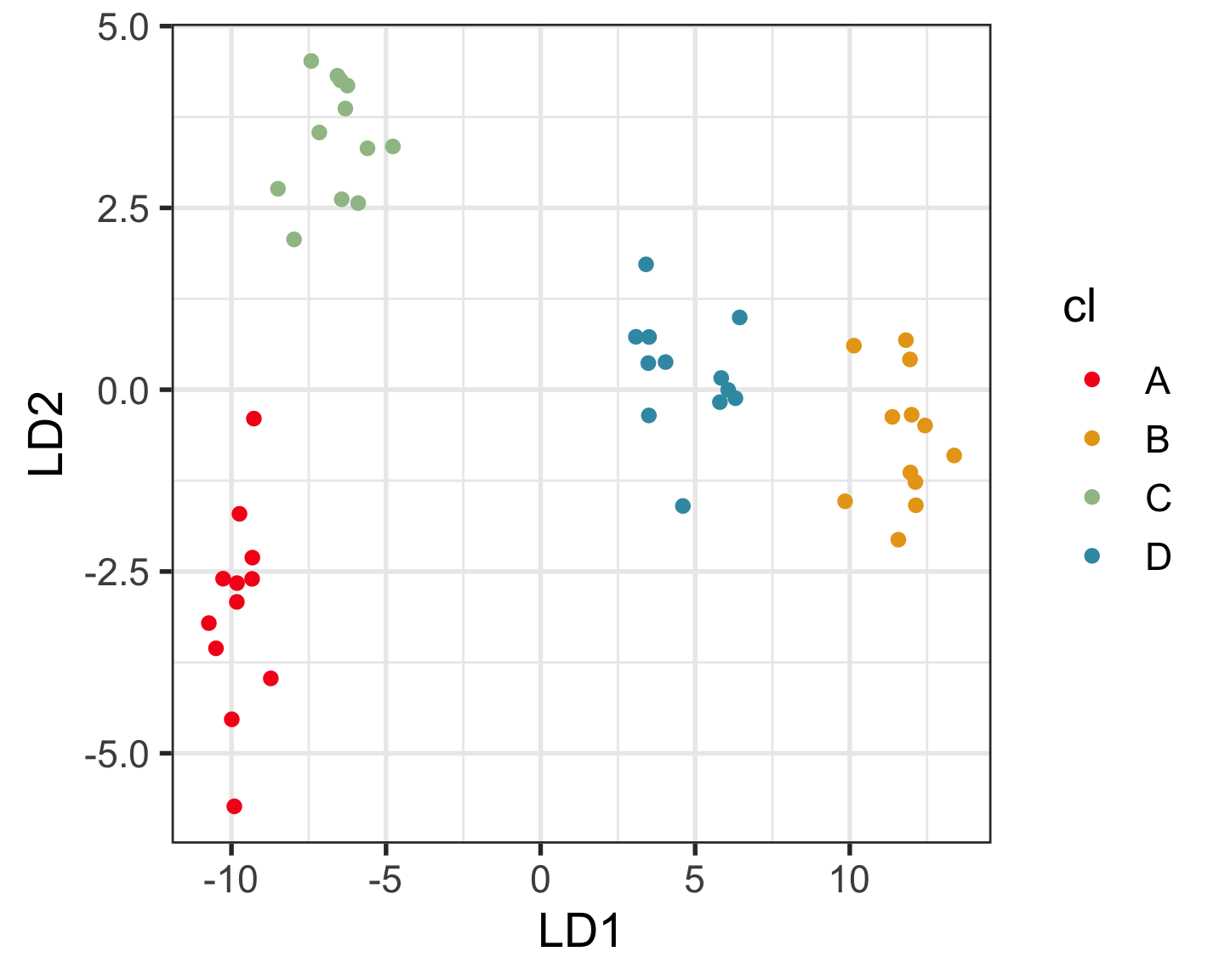
Why visualise? Which is the better?

Nuisance cases

Nuisance variables

To decide on a best result, you need to see how it divides the data into clusters. The cluster statistics, like dendrogram, or cluster summaries, or gap statistics might all look good but the result is bad. You need to see the model in the data space!

Model-based clustering (1/3)

Model-based clustering fits a multivariate normal mixture model to the data.

\[ \Sigma_k = \lambda_kD_kA_kD_k^\top, ~~~k=1, \dots, g \]

where

\(\Sigma_k\) is the variance-covariance of cluster \(k\),

\(g=\)number of clusters,

\(D_k\) describes the orientation of a cluster,

\(A_k\) describes the variance in different variables,

\(\lambda_k\) is an overall size.

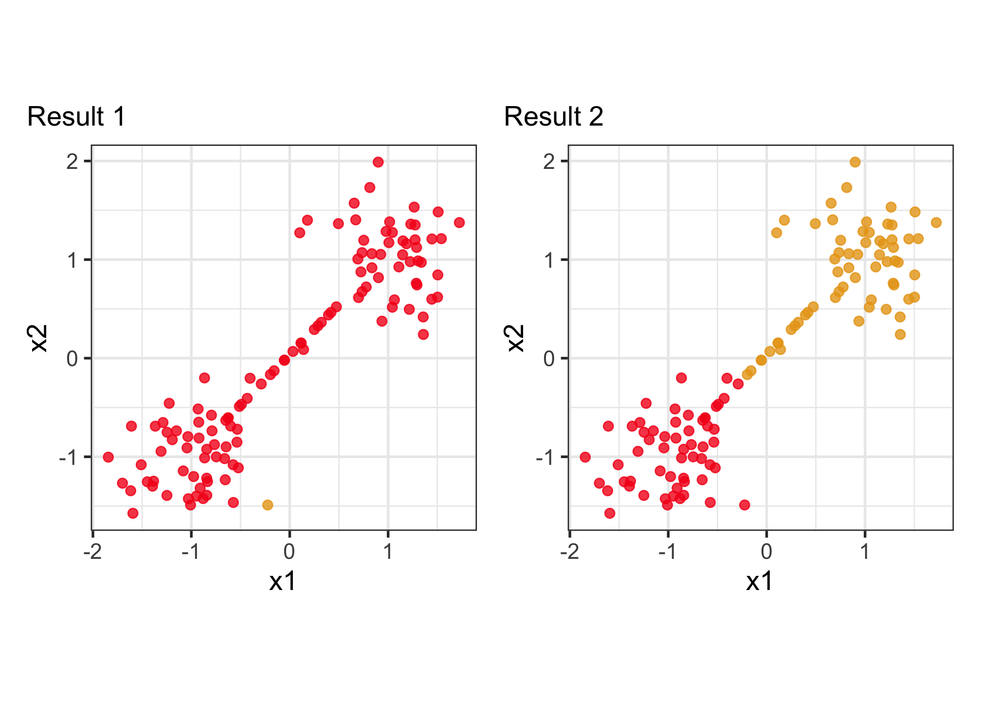
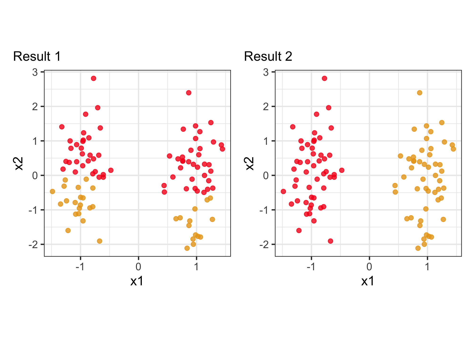
Model-based clustering (2/3)

Clustering this data. What do you expect?

Can we assume the shape of the clusters is elliptical?

Volume, Shape, Orientation

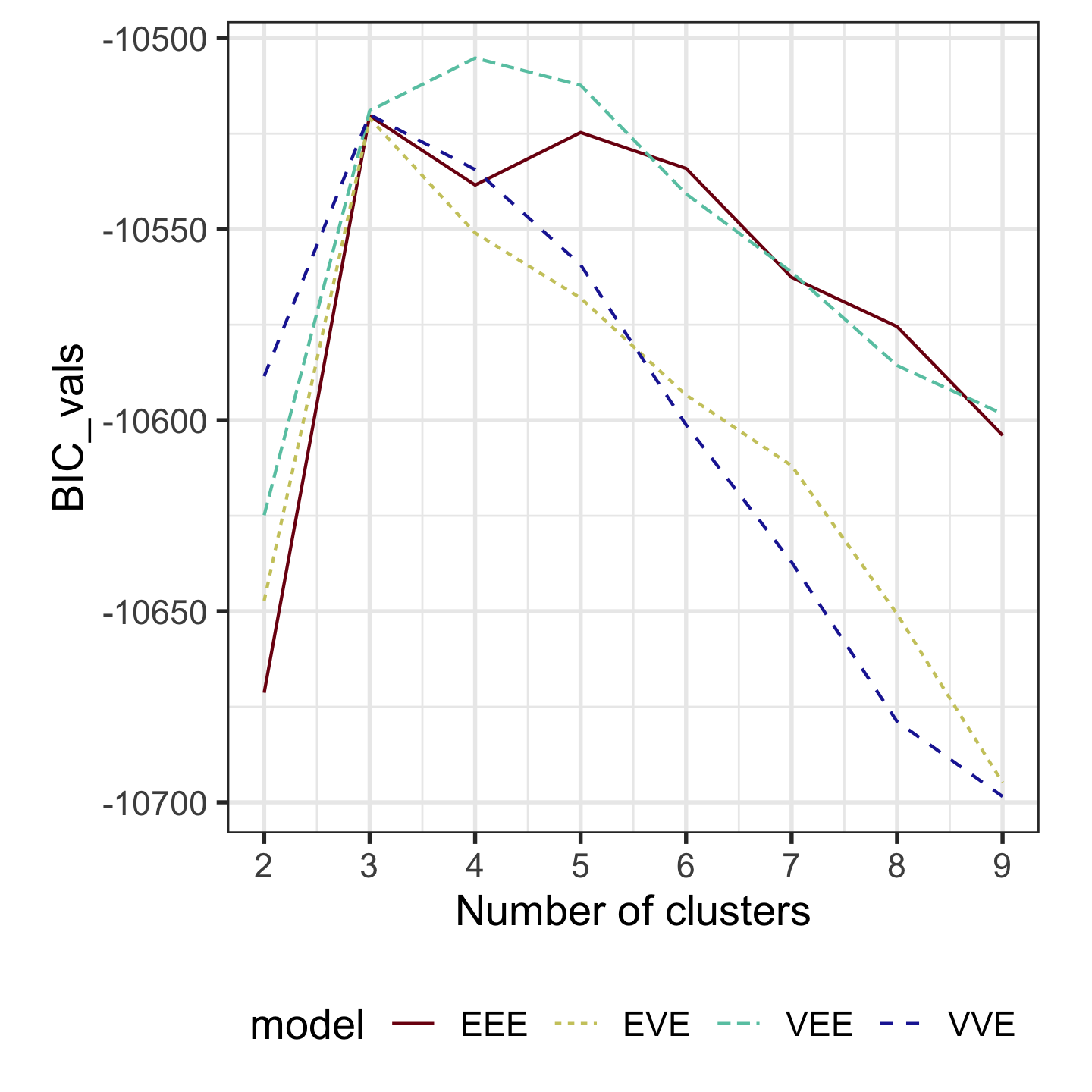
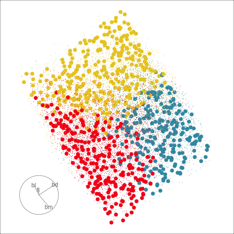
Model-based clustering (3/3)
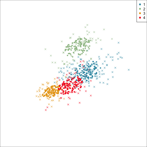
Four-cluster VEE

Three-cluster EEE

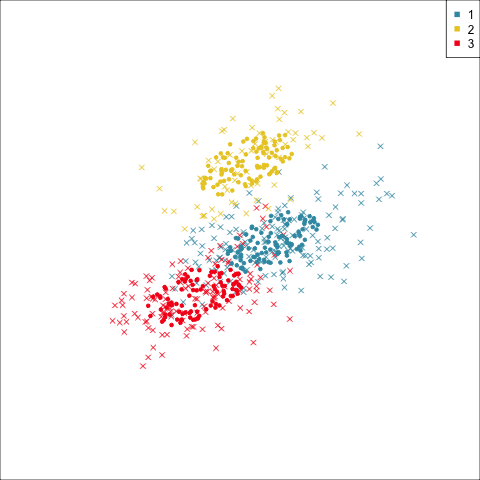
Models (ellipses) are overlaid on the data. Which is the best fit?

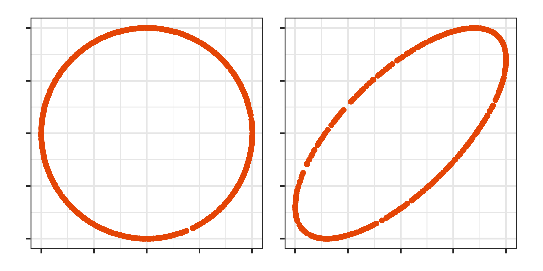
How do you draw ellipses in high-d?

Extract the estimated model parameters

p_mc <- Mclust(
  p_tidy[,2:5], 
  G=3, 
  modelNames = "EEE")
p_mc$parameters$mean
   [,1] [,2] [,3]
bl   39   48   49
bd   18   15   18
fl  190  217  196
bm 3693 5076 3754
p_mc$parameters$variance$sigma[,,1]
      bl    bd     fl     bm
bl   8.4   1.6    8.3    755
bd   1.6   1.2    3.5    318
fl   8.3   3.5   42.5   1751
bm 754.7 318.4 1751.2 211467

Generate data that represents the ellipse(s) to overlay on the data.

p_mce <- mc_ellipse(p_mc)
  • Sample points uniformly on a pD sphere
  • Transform into an ellipse using the inverse variance-covariance matrix

Your turn

Use the spin-and-brush approach to extract the clusters from the c1 data.

05:00

Classification

What should you visualise?

  • Understand any clustering related to the known classes.
  • Obtain a sense of where boundaries might be placed.
  • Examine where the fitted model fits the data well, and where poorly.
  • Understand the misclassifications, whether they are reasonable given uncertainty in the data, or due to an ill-fitting or poorly specified model.
  • Understand what can happen with model fitting and pattern recognition with sparse data.

Example: Linear DA

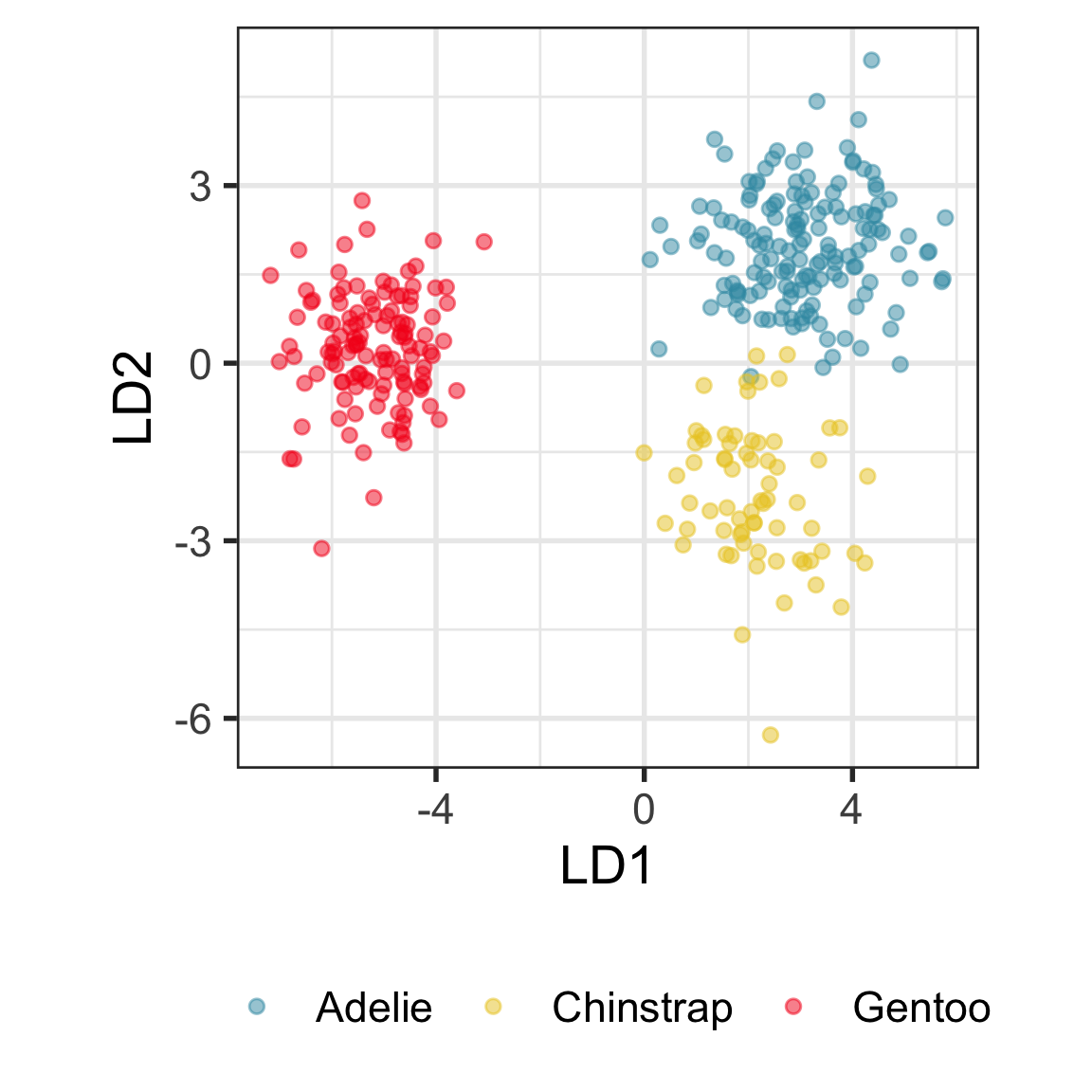
Linear discriminant analysis is the ideal classifier for this data.

Random forests (1/2)

A random forest is the simplest classifier to fit for complicated boundaries. It is built from multiple trees generated by randomly sampling the cases and the variables. The random sampling (with replacement) of cases has the fortunate effect of creating a training (“in-bag”) and a test (“out-of-bag”) sample for each tree computed. The most beautiful results are obtaining diagnostics that help us to assess the model are the votes, the measure of variable importance, and the proximity matrix.


Call:
 randomForest(formula = cause ~ ., data = bushfires_sub, importance = TRUE) 
               Type of random forest: classification
                     Number of trees: 500
No. of variables tried at each split: 7

        OOB estimate of  error rate: 11%
Confusion matrix:
            accident arson burning_off lightning
accident          73     3           0        62
arson             11     8           1        17
burning_off        3     0           3         3
lightning         14     0           0       823
            class.error
accident          0.471
arson             0.784
burning_off       0.667
lightning         0.017

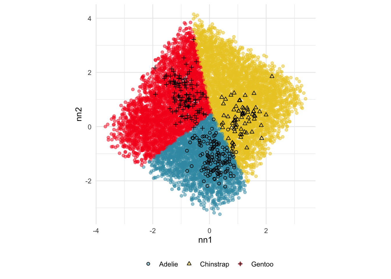
Random forests (2/2)

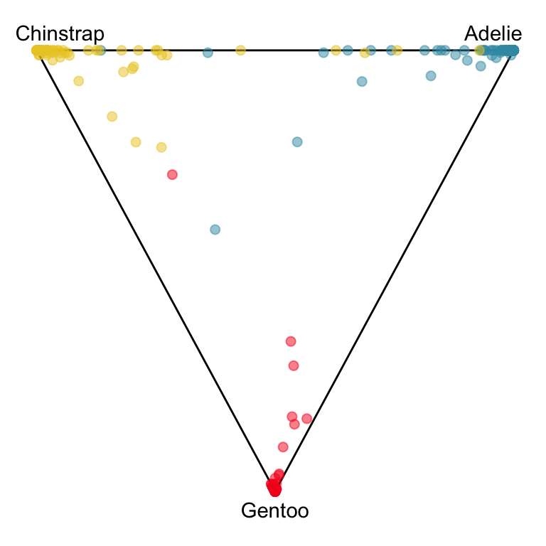
The votes matrix can be considered to be predictive probabilities, where the values for each observation sum to 1. With 3 classes it is a 2D triangle. For 4 or more classes it is a simplex and can be examined in a tour.

Votes matrix for the random forest fit on penguins

Votes matrix for bushfire model fit

Code
# Create votes matrix data
bushfires_rf_votes <- bushfires_rf$votes %>%
  as_tibble() %>%
  mutate(cause = bushfires_sub$cause)

# Project 4D into 3D
proj <- t(geozoo::f_helmert(4)[-1,])
b_rf_v_p <- as.matrix(bushfires_rf_votes[,1:4]) %*% proj
colnames(b_rf_v_p) <- c("x1", "x2", "x3")
b_rf_v_p <- b_rf_v_p %>%
  as.data.frame() %>%
  mutate(cause = bushfires_sub$cause)
  
# Add simplex
simp <- simplex(p=3)
sp <- data.frame(simp$points)
colnames(sp) <- c("x1", "x2", "x3")
sp$cause = ""
b_rf_v_p_s <- bind_rows(sp, b_rf_v_p) %>%
  mutate(cause = factor(cause))
labels <- c("accident" , "arson", 
                "burning_off", "lightning", 
                rep("", nrow(b_rf_v_p)))

animate_xy(b_rf_v_p_s[,1:3], col = b_rf_v_p_s$cause, 
           axes = "off", half_range = 1.3,
           edges = as.matrix(simp$edges),
           obs_labels = labels)

Exploring misclassifications

library(crosstalk)
library(plotly)
library(viridis)
p_cl <- p_tidy_std |>
  mutate(pspecies = predict(p_lda, p_tidy_std)$class) |>
  dplyr::select(bl:bm, species, pspecies) |>
  mutate(sp_jit = jitter(as.numeric(species)),
         psp_jit = jitter(as.numeric(pspecies)))
p_cl_shared <- SharedData$new(p_cl)

detour_plot <- detour(p_cl_shared, tour_aes(
  projection = bl:bm,
  colour = species)) |>
    tour_path(grand_tour(2), 
                    max_bases=50, fps = 60) |>
       show_scatter(alpha = 0.9, axes = FALSE,
                    width = "100%", height = "450px")

conf_mat <- plot_ly(p_cl_shared, 
                    x = ~psp_jit,
                    y = ~sp_jit,
                    color = ~species,
                    colors = viridis_pal(option = "D")(3),
                    height = 450) |>
  highlight(on = "plotly_selected", 
              off = "plotly_doubleclick") %>%
    add_trace(type = "scatter", 
              mode = "markers")
  
bscols(
     detour_plot, conf_mat,
     widths = c(5, 6)
 )                 

DEMO

Your turn

Explore the misclassifications in the random forest fit of the penguins data, using the code provided in the slides2.R file.

05:00

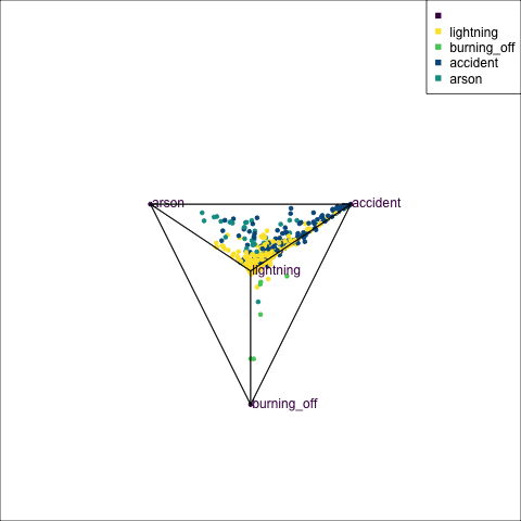
Cautions about high-dimensions

Space is big.

What might appear to be structure is only sampling variability.

\(n=48, p=40\)

Permutation is your friend, for high-dimensional data analysis.

Permute the class labels.

set.seed(951)
ws <- w |>
  mutate(cl = sample(cl))

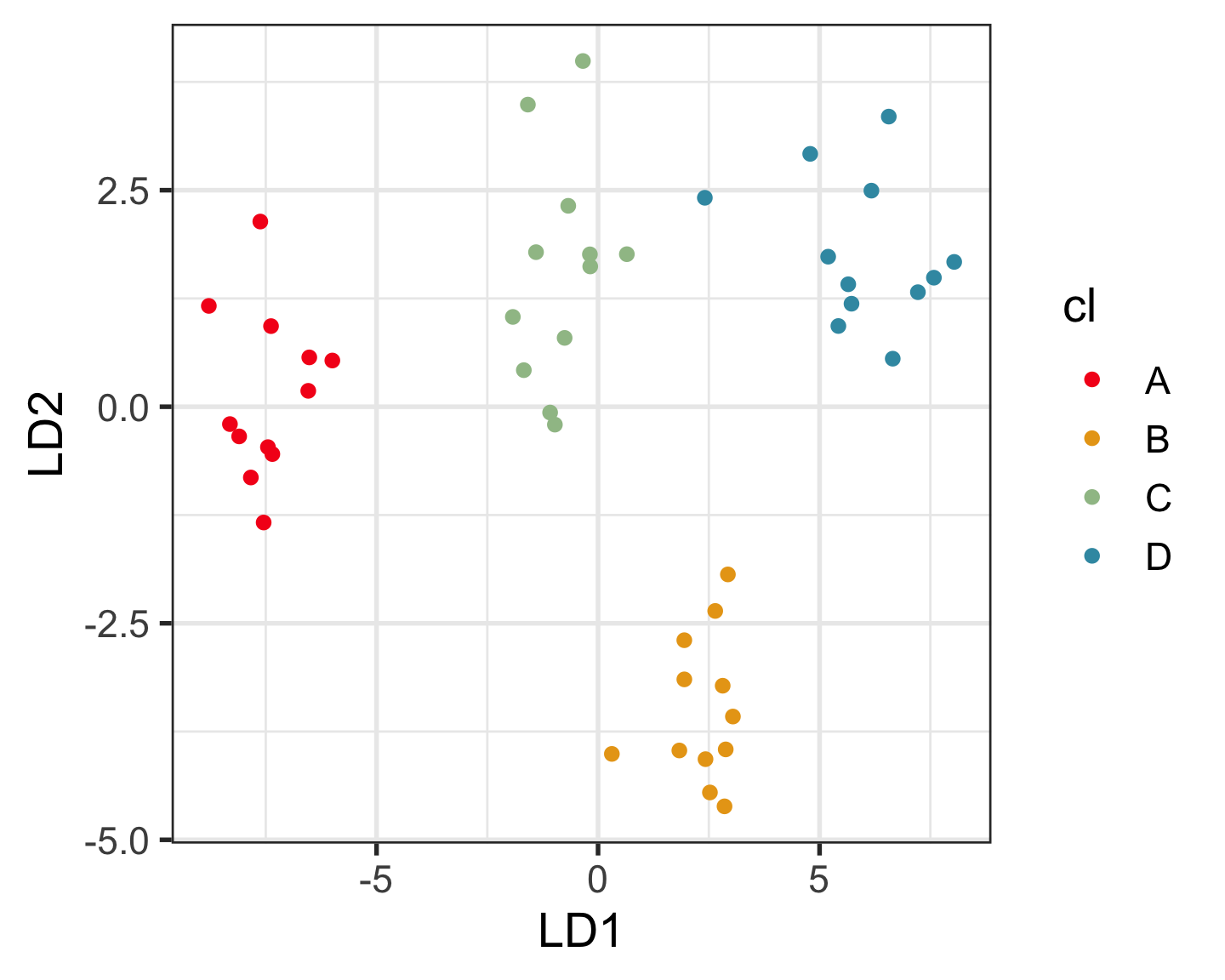
Other compelling pursuits

Explore and compare the boundaries of different models using the slice tour.

Dissect and explore the operation of a neural network.

Where to learn more

All of the material presented today comes from

Cook and Laa (2024) Interactively exploring high-dimensional data and models in R
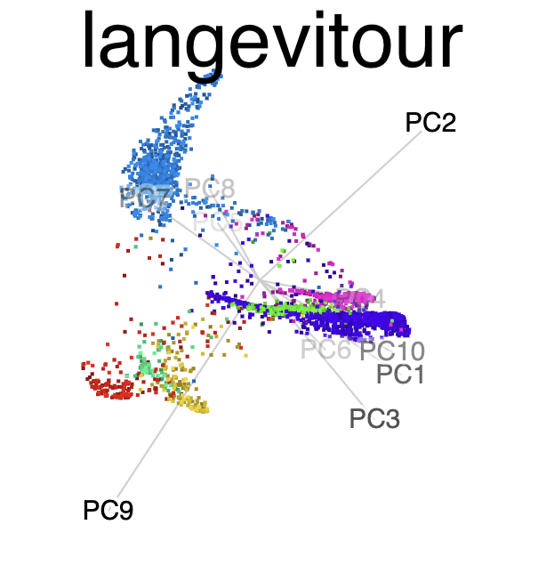
Software:

\(~~\) \(~~\) \(~~\) \(~~\)

End of session 2

Creative Commons License
This work is licensed under a Creative Commons Attribution-ShareAlike 4.0 International License.